Exploratory Data Analysis
The first step in EDA is to clean the data that we have collected. This step requires us to drop undesired columns and check for null values in each existing column. Upon looking further into the data that was collected, we discerned that the data from our Foreground-Window IL would be best suited for our prediction model. We then made sure that each value of the data was of the correct data type. Further evaluating the data, we noticed there were instances where our data contained “Missing String.” in a few rows in relation to a few applications as shown in the figure below.

After our thorough investigation, we came to realize that this was because we were not saving the name of the window in Unicode, and therefore, special characters were not being recorded; instead, it was showing us the “Missing String.” However, upon fixing this, there were still instances where the file explorer tab returned an empty string when it was accessed as shown below.

To keep everything consistent, we decided to impute both the “Missing String.” and the empty entries (related to the File Explorer) with empty strings. Imputation allowed these rows to be used without affecting the overall distribution of the data. Even though there were imputations implemented in our pre-processing step, they did not affect our data as we mainly worked with application names.
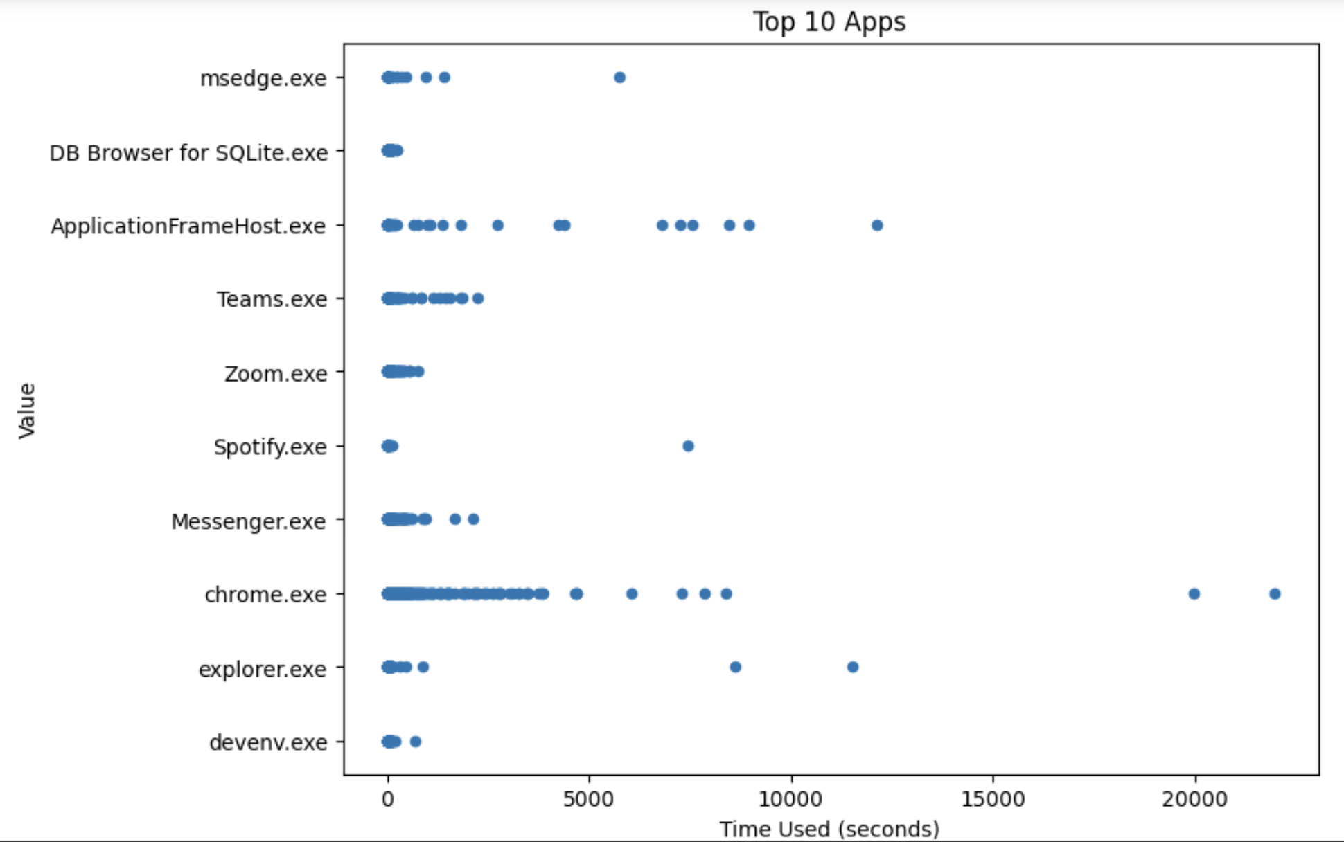
Next, we looked at the spread of the data and calculated the use time for each instance of the recorded data. We looked into the top 10 most used applications in terms of time spent on them and created a scatter plot to see if there were any outliers.

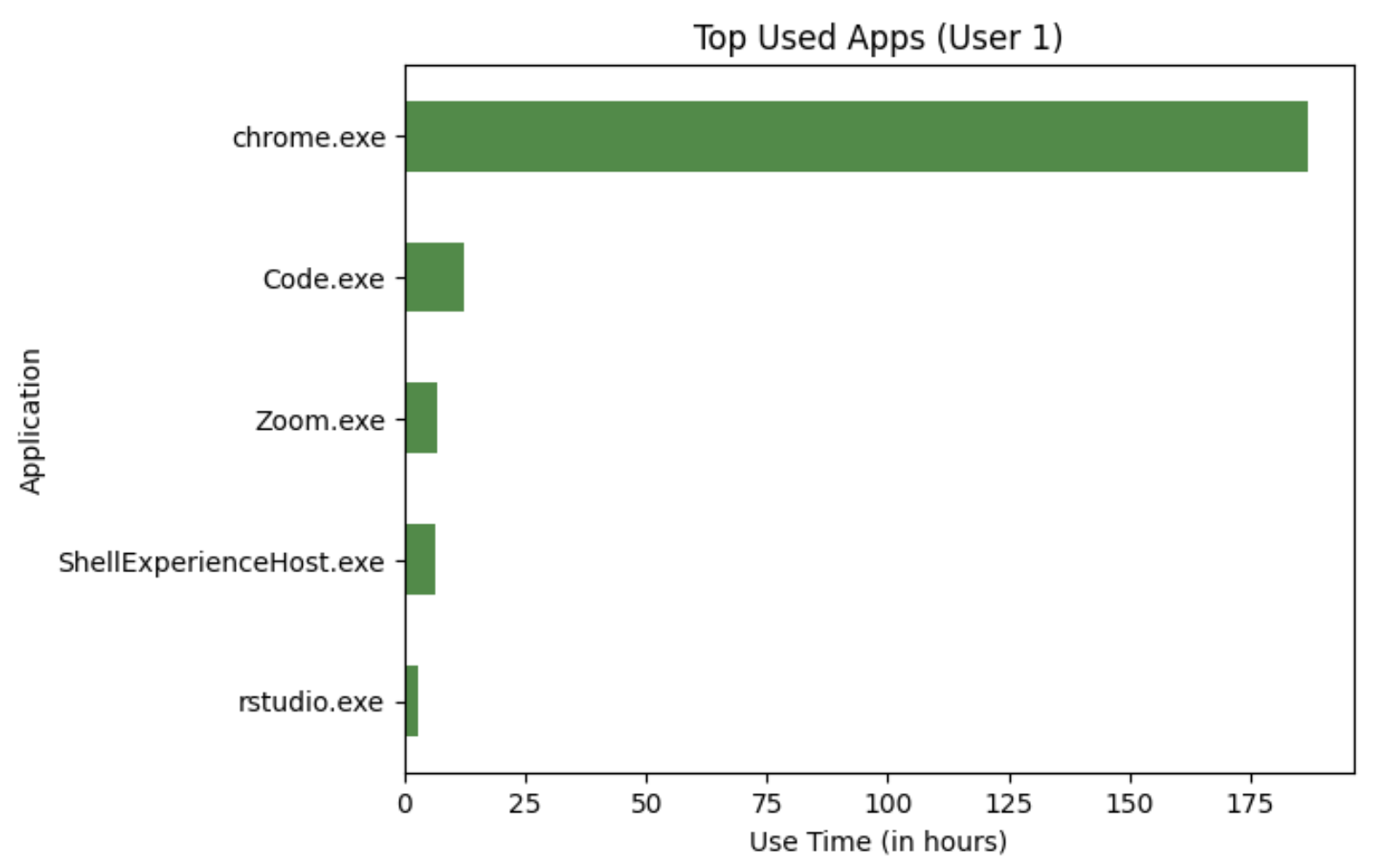
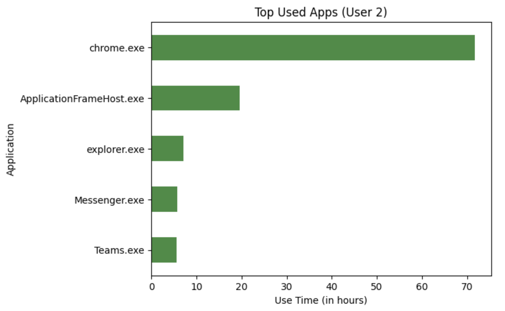
It can be seen that chrome.exe has two instances of time recorded that are about 20000 seconds. We did not consider this to be something wrong with the data, but rather it seemed to be aligned with a student’s usage of Chrome. We also draw bar charts to explore and summarize the trend of the user’s usage time across the top 5 used apps.


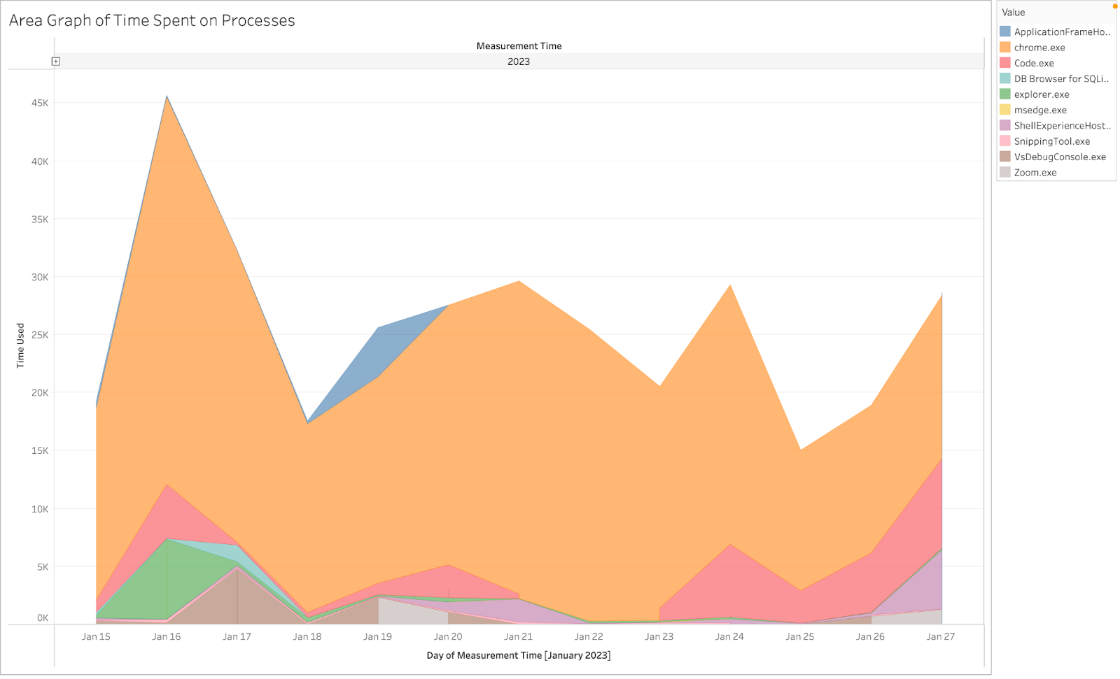
As you can see the top most used app amongst both users is Google Chrome. However, the usage time for them differ amongst both users. The applications that take up the top 5 for each user differ as well. The following charts below will show the usage of processes in terms of elapsed time for a given day. From visualizations like the bar chart, we can see the largest contributor to the data collected is Chrome, but the area chart adds an additional layer of information regarding the distribution of chrome usage across the time period of when the data was collected. In this way, these visualizations supplement one another well.

On top of these visualizations, we also focused on the use of time series analysis to further note patterns in the data. As it can be seen below, this user's usage pattern shows that on most days they use their PC either early in the morning or during the evening while rarely using their PC during the middle of the day. We believe this to be characteristic of a student's usage of their PC.

We further use this collected data and information we've found by analyzing and cleaning the data with our models to find further insights.